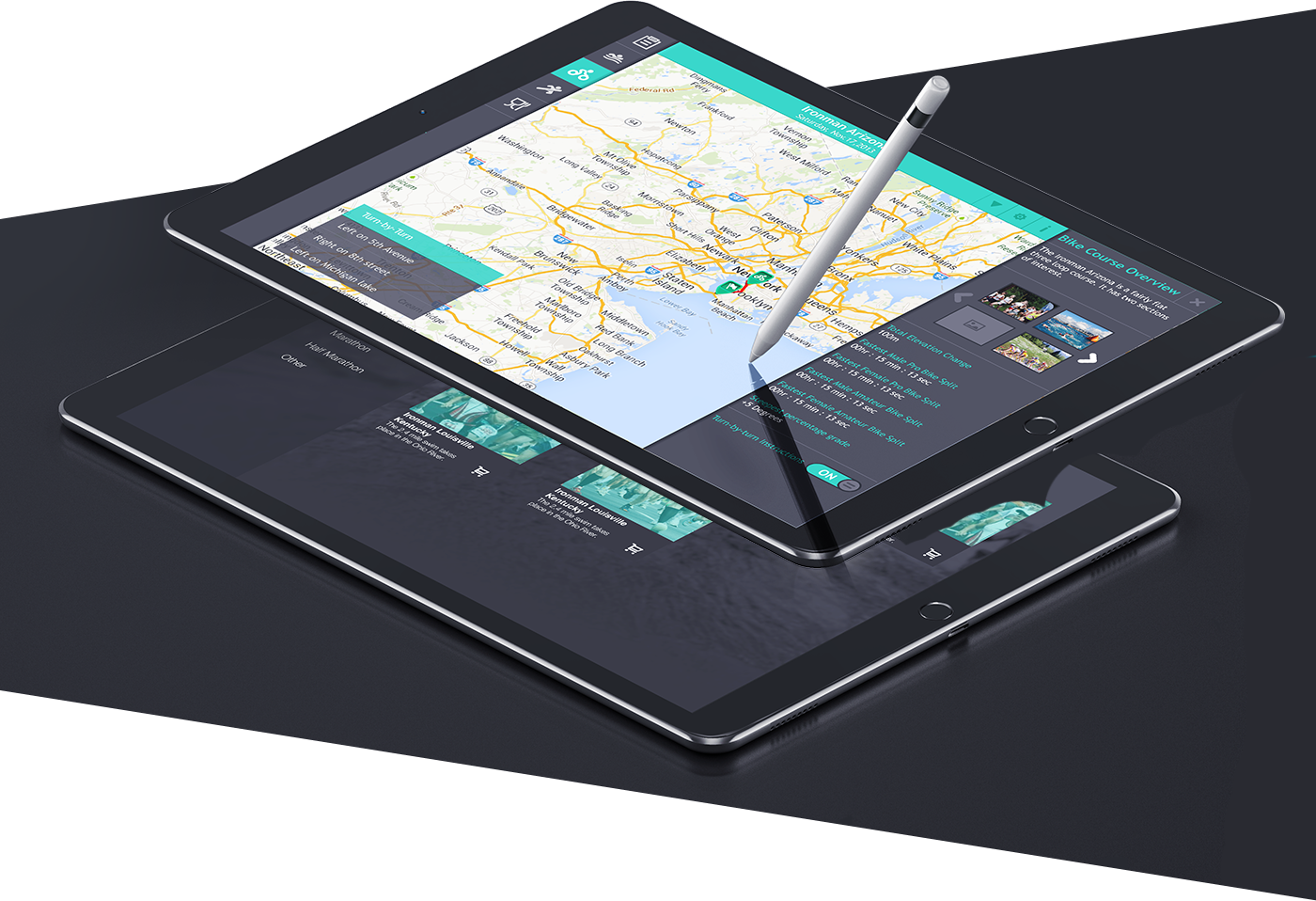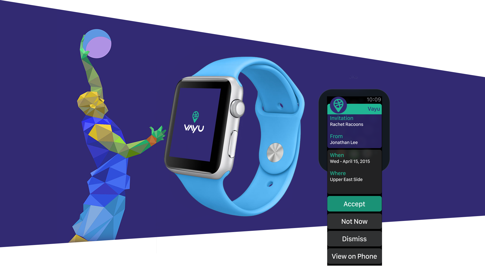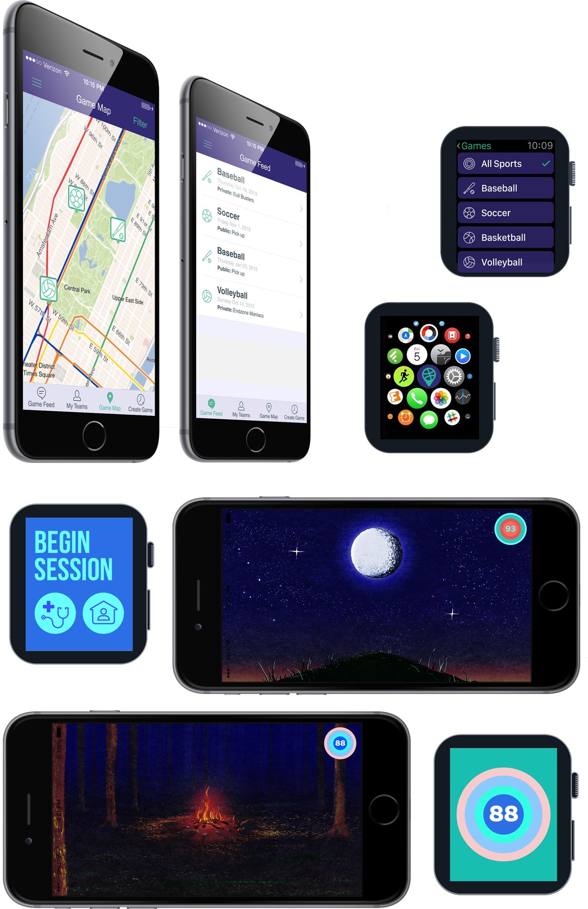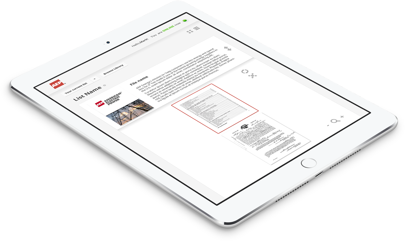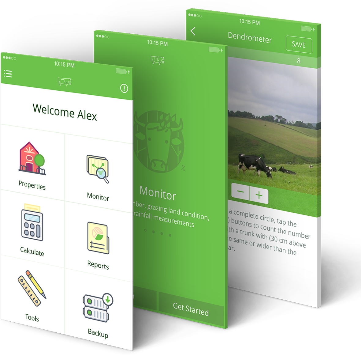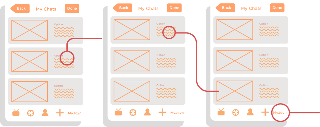
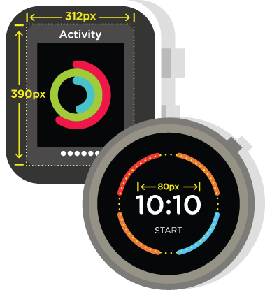
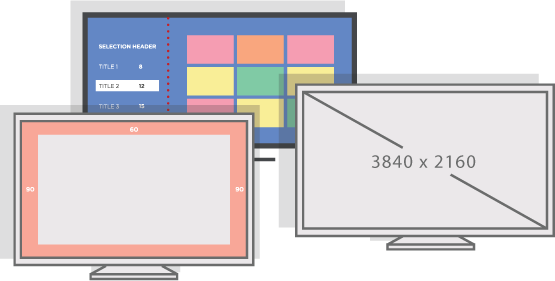
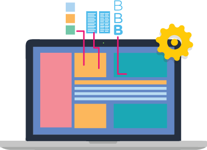

Optimizing user experience is crucial for connecting with your users, but in-depth research into user experience can be very costly. Budgets are finite, and every project must have a balancing point for investing in understanding its users. Apple has spent more on understanding how users interact with iOS devices than you ever will, and they have formalized that research into best practices that immediately save you money and improve the quality of your product. App Design goes so much deeper than just how hip and pretty the design is. Experience and understanding of Apple's Human Interface Guidelines (HIG) is a foundation that will directly save you money through streamlined user experience in ways you easily can overlook if you're unaware of them.

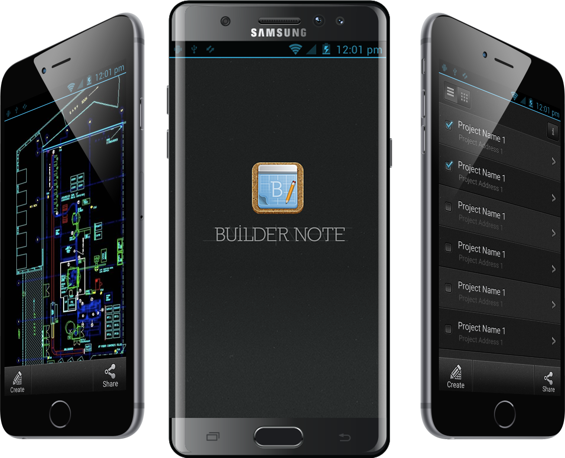
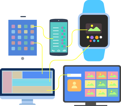
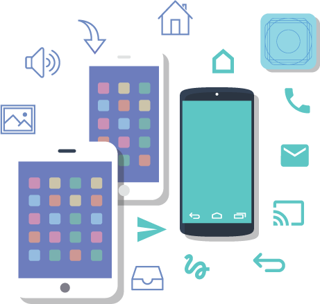
Apple and Google have each invested more money than you ever would into streamlining user experience across their platforms. Android is very unique in its own way, and how people use the platform is inherently different than iOS. Throw in the existing number of different Android manufacturers, each with its own system variants, and you can appreciate the wide diversity requiring very different design patterns than iOS. Using the identical design across Android and iOS would negate the huge benefit gained from specialized design skills leveraging Android's Material Design and Apple's HIG.
